Annunites Withdrawals
— Problem
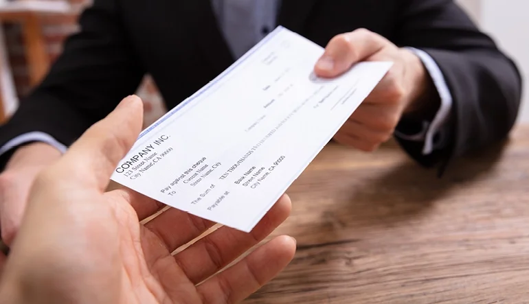
Users must call in or fill out a paper form to secure their own funds.
Current process take too long, and puts a strain on the current call center. Additionally transactions may only be initiated during bussiness hours.
Team Roles
Designer
Date
June - Dec 2021
Methods
Time Management
Design Thinking
Practices
User Survey
User Interviews
Usability Patterns
A/B Testing
Tools
Pen & Paper
Adobe XD
Salesforce
Scope & Planning
Taking ownership of the project mid-flight introduced a unique set of challenges, as several foundational product and technical decisions had already been established prior to my involvement. Stepping into a lead role required quickly assessing the current state of the experience, aligning cross-functional stakeholders, and identifying opportunities to streamline both the user journey and operational workflows without disrupting delivery timelines.
My primary responsibility was driving the initiative through execution and successfully delivering the experience before year-end deadlines. In parallel, I worked closely with product, engineering, and business teams to prioritize high-impact improvements that balanced user needs, compliance requirements, and operational efficiency.
The outcome resulted in an estimated annual savings of $900K for the business while significantly improving the customer experience by reducing fund disbursement timelines from 9 days to 3 days.
Taxes + Fees
1st major hurdel was to integrate a page where the user could elect their withholdings for federal and state. With the API calculator completed I was constricted to keeping this on one single page, and run the calcultor on the “action” within Salesforce.
Launched in October, a month before this study, I received no update, no email about the new feature, or in app notification. We have seen this many times before, a quick in app onboarding with interactions taking you to and or thought he new process. There was none.
**Resources
https://newsroom.wf.com/press-release/innovation-and-technology/wells-fargo-reimagines-mobile-experience-pay-wells-fargo
https://www.businesswire.com/news/home/20181001005683/en/Wells-Fargo-Launches-Control-Tower-SM-New
Let’s Fix it…..But how?
Icon vs Verbiage
Forgoing wire frames to solve this problem, I focused my attention on the hierarchy of the apps information architecture. It appeared their new features were within the largest navigation on any given screen. I also noticed during testing, the second most used area was the same navigation.
Setting up for more testing I designed new icons for Control Tower some found on the app and some newly designed. Following design patterns found within the app, I knew I would have to pair with verbiage. In addition due to pain points uncovered in the user interviews testing accopainy verbiage that coincided with the feature was crucial.
Ideation
The easiest features to find are located within the secondary navigation on the app. this changes from screen to screen, but has one thing in common, Icons mixed with simple words. I believe this is how we solve this problem.
Iconography
Verbage
Linked Payments
Subscriptions
Cyber Payments
Monthly Payments
Autopay
Automatic Payments
Recurring Payments
Digital Payments
Gamified Testing
Testing would be a pairing game with the icons and verbiage. Users were given the below groups of icons and words. Users were to “Pair the icon with the word you feel best describes it”.


Results
Utilizing classmates, friends, and family. These are the results of the icon/verbiage pairings. Recurring and along with the “Dollar Cycle” Icon came out on top with 6 people matching them together. Many people matched one icon with one term, two people going rouge and attaching multiple names to single icons.

High Fidelity Mockups
Utilizing the r
